|
Introducing...
Phil Erlanger Research announces the introduction of the world’s
first institutional platform for advanced
applications of equity analysis - Erlanger
2000 (E2K).
Visit the Erlanger
2000 Online Help System
Charts of the Week (submitted
08/27/01):
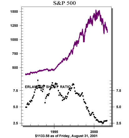
Amazingly, the S&P 500 has dropped from above 1300 to below
the 1200 level, and yet the CBOE Volatility Index is lower at 22.29.
Increased bullishness in the face of declining prices is not a healthy
sentiment picture. Moreover, short selling (see chart above)is little
changed as the components of the major averages saw only slight
increases in their short interest ratios - far from levels that
would encourage us to try the long side of the market. Long time
readers are aware of the factors that have tempered our enthusiasm.
Apart from the appalling technicals, the seasonal factors we follow
have now led us to this nexus for the market. The most significant
seasonal period is September and October, annually the weakest months
for the market - in a year (2001) that our cycles show to be severely
negative. There are sectors that have performed relatively well
(health services, consumer non-durables and finance), but we are
very skeptical about the overall market. From a timing point of
view, this is a time to sell, not buy. Our focus is on the top 3
sectors, but we would watch to see if they hold up during any forthcoming
weakness before adding positions. Maintain your most defensive posture
for now.
Charts of the Week (submitted
08/13/01):
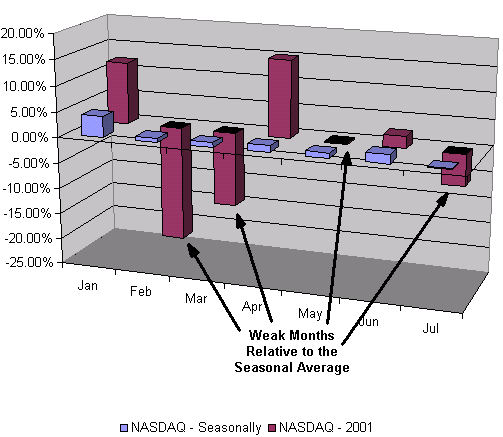
The action of the NASDAQ during 2001 has to be classified as sub-par.
This chart (above) shows the month by month change from a historical
(seasonal) view and for 2001. This chart shows better than average
performances for January, April and June (seasonally the strongest
months of the first half of the year). The weaker seasonal months
of the first half of the year are Feb, Mar and May. July is typically
flat. The NASDAQ significantly underperformed during these four
weaker months, as the table below demonstrates.
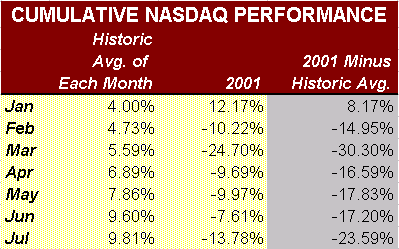
Overall, the cumulative 2001 NASDAQ "Jan through July"
performance is 23.59% below its typical "Jan through July"
performance. Therefore, during 2001, the NASDAQ has done much worse
in seasonally weaker months than it has done better in seasonally
stronger months. We mention this because the months ahead, specifically
September and October, are the seasonally weakest months for the
NASDAQ. We are going to learn much in these months about the primary
trend for the NASDAQ. If its 2001 behavior persists, new lows are
likely. In the unlikely event that the NASDAQ behaves strongly through
October, then and only then would we be encouraged.
Charts of the Week (submitted
07/30/01):
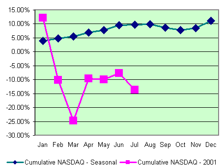
If a market performs better than its seasonal cycle, it's a bull
market. The reverse is a bear market. The worst 4 months of the
year for NASDAQ issues are July through October (see July 9th Squeeze
Play). Interestingly, the NASDAQ has underperformed during the seasonally
favorable months that preceded(see chart above), which identifies
the current market as a bear. To make matters worse, the sentiment
picture couldn't be worse. Short selling is historically light relative
to market volume. The VIX and VXN volatility indices are at levels
associated with excess bullishness. The Investors Intelligence measure
of bearish market letter writers is down to 23.7% (the 5 year high
low is 47.5% and 22.6%). This lack of bearishness is in the face
of a slaughtered NASDAQ, multiple 16 year lows in the NIKKEI, costly
bank failures, and unexpected earnings and revenue downfalls.
The "can't get any worse" thinking has followed every
disappointing development this year. We need to see "can't
get any better" thoughts before a bottom can be contemplated.
To get bold about stocks now before the September/October period
is unwarranted speculation.
Charts of the Week (submitted
07/09/01):
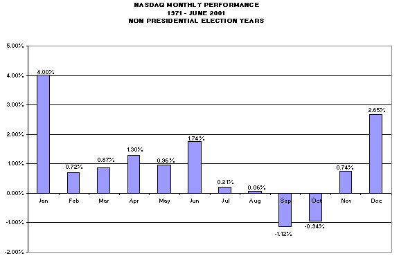
We were thumbing through our copy of Trader's Almanac and found
an interesting study on Nasdaq seasonality. We decided to do the
math ourselves, and came up with the chart above. Essentially, the
worst 4 month period of any year for the Nasdaq is July through
October. This is especially true in years other than an election
year. September and October are the only months to average negative
returns (-1.12% and -0.94% respectively.) We are concerned because
our 20-year seasonal cycle is also extremely negative for another
year. With short selling relatively light and insider selling seemingly
heavy (see Barron's this week), the technical/sentiment picture
remains poor. The current decline phase is not yet mature, since
the VIX (25.09) is still well short of the 35 area. We reiterate
our cautious stance.
Charts of the Week (submitted
07/02/01):
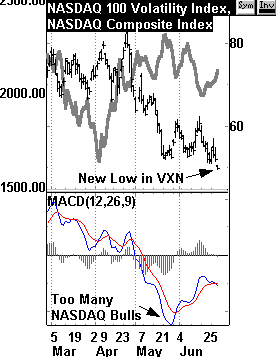
One phenomenon has been a huge factor perpetuating our bearishness:
everyone else's bullishness. Throughout the decline of the markets,
and especially throughout the huge decline in Nasdaq issues, the
"slope of hope" has dominated the sentiment landscape.
Now we believe that picture is getting worse.
The newest "volatility" measure on the block is the CBOE's
VXN (Nasdaq Volatility Index). This is based on the implied volatility
of the Nasdaq 100 index (NDX) and is based upon the hypothetical
at-the-money NDX option with 30 days expiration. We are concerned
about the behavior of the VXN. It is very low at a current reading
of 45.49 (and falling). The last time it was this low was (seasonal
gulp!!!) last July. Remember last July? That was the beginning of
the aggressive portion of the Nasdaq's demise. Most importantly,
it was preceded with a sicking expectation for higher prices. Why
sickening? A sick market is one where bullishness expands despite
lower prices. Bullishness normally expands as prices rise and vice
versa; but last July the VXN sank from 51.65 (7/14/00) to its low
of 40.56 (8/31/00). This was despite the fact that the Nasdaq failed
to move higher (see dashed lines).
This "sickening" bullishness is happening again. From
the reaction highs in January 2001, the Nasdaq has had a steady
string of lower highs. This decline has been met with increasing
bullishness as measured by the falling VXN. From our point of view
this is approaching a point of risk similar to what was experienced
a year ago. Until the current decline phase is mature, remain very
selective.
Charts of the Week (submitted
06/18/01):
After the trouncing last week, it is reasonable to expect somewhat
of a breather. However, we are not out of the current decline phase.
Last week's closing VIX was a paltry 26.33 (60.55 for the VXN).
We need to see higher numbers like 35 and 75 respectively before
the requisite level of angst sets the stage for the next advance
phase. Moreover, there was heavy call buying in IBM on Friday -
not the kind of speculation you want to see in a decline phase.
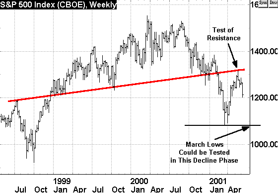
As the chart to the right suggests, the S&P 500 touched key
resistance at the end of the last advance phase... we expect a good
test of the March lows before the decline is done. If the March
lows fail, the downside follow-through could be nasty.
Charts of the Week (submitted
06/11/01):
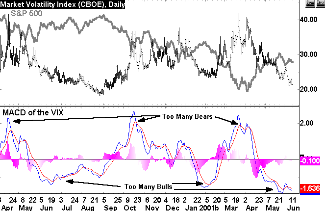
Over the years we have benefited from the examination of the VIX
(CBOE Volatility Index). The VIX is a superb barometer of market
health because it reflects core sentiment on the part of equity
options traders. A high VIX reflects the willingness of equity options
traders to overpay for put options versus call options. As can be
seen in the chart above, the market has had its best times when
there were "too many bears". The market plummeted when
there were "too many bulls". The current observation is
that there are "too many bulls" - a reason to be cautious.
Charts of the Week (submitted
06/04/01):

Leadership trends do not instill much confidence in us about the
market's near-term prospects. The high beta technology sector has
fallen flat on its face. The meaningful rotation we do see is into
inflation-sensitive and defensive issues
Charts of the Week (submitted
05/21/01):
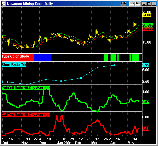
Short interest and sustained put buying have given support to the
breakout in precious metal issues.
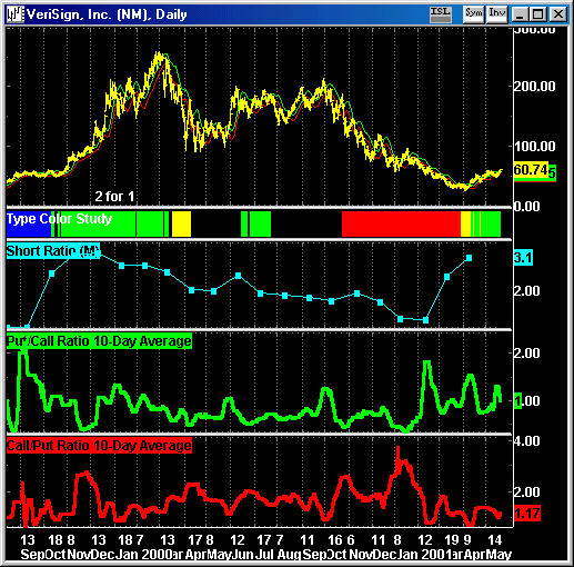
There is a lot of overhead resistance in issues such as VRSN, but
this is a case where the short sellers are being squeezed and the
put buyers are losing.
Charts of the Week (submitted
05/16/01):
Charts of the Week (submitted
05/08/01):
Charts of the Week (submitted
05/03/01):
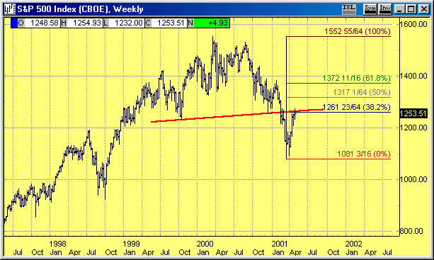
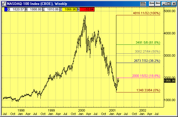
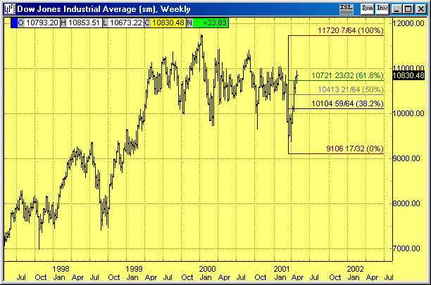
The indices have "retraced" their bear market declines
to various degrees. The DJII (below) has risen just above its 61.8
retracement level - that was the best index move. The S&P 500
retraced about 38.3% of its primary trend decline. The Nasdaq 100
Index retraced 18.8% of its decline. All indices have risen to test
resistance levels, which is a setup for the next decline phase.
Charts of the Week (submitted
03/30/01):
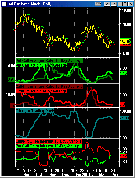
While the long-term posture of the market remains bearish, the
current advance phase represents a meaningful relief rally. This
rally is expected to continue until the VIX gets below 30 (and likely
back down to the mid 20s). We are also watching key stocks like
IBM. Currently, IBM is in a "LONG" trading mode. We determine this
by evaluating the posture of IBM's equity option trading activity
(see chart). In late October and again in late December, the "put"
activity clearly dominated the "call" activity - indicating excessive
negative bets and a time to buy into any signs of price strength.
Such signs soon followed as IBM's price rallied above it's displaced
moving average (DMA) lines. We again see a similar if somewhat diminutive
posture in IBM's options trading - and price is now above it's DMA
lines. But a word of perspective: Note in our IBM chart that
there were trading setups to sell IBM - these were in September
and late January when "call" activity dominated over "put" activity.
These were also in sync with the primary bear trend, and thus had
results far superior to the long trades. Current long trades are
contrary to the bear trend, and thus are speculative and risky.
Stop losses should be tight and expectations kept to a minimum.
If the VIX gets to 25 or so, take these long chips off the table.
Charts of the Week (submitted
03/26/01):
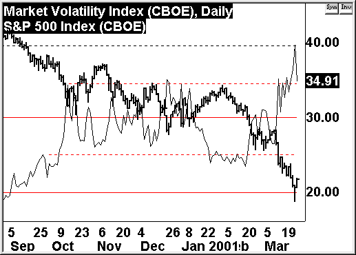
Last week the markets again reacted negatively to a Greenspan
rate cut. As the disheartened increased their selling, the all important
9600 level (that had contained the entire 2-year Dow foray into
5 digits) failed. However, Thursday's (03/21/01) intraday low of
9106.54 finally brought the VIX CBOE Volatility Index (above) to
40, which we envisioned would be needed before the next advance
phase.
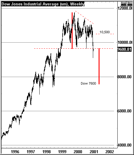
As we noted in our interim report (and contemplated in many previous
writings), the 9600 level was critical. Now that this level is broken,
it becomes the first line of resistance for the current advance
phase. This 9600 violation also creates a nasty looking overhead
pattern for the Dow that has a downside count below 8000, but that
downside objective is perhaps destined for some future decline phase.
For now, the focus is on how constructively the current advance
phase unfolds. The most important thing to watch is how quickly
the VIX drops. We would expect something in the mid to high 20s
to be coincident with the end of the advance phase. For the Dow,
resistance levels are 9600-9700, 10,000 and possibly 10,500.
Charts of the Week (submitted
03/21/01):
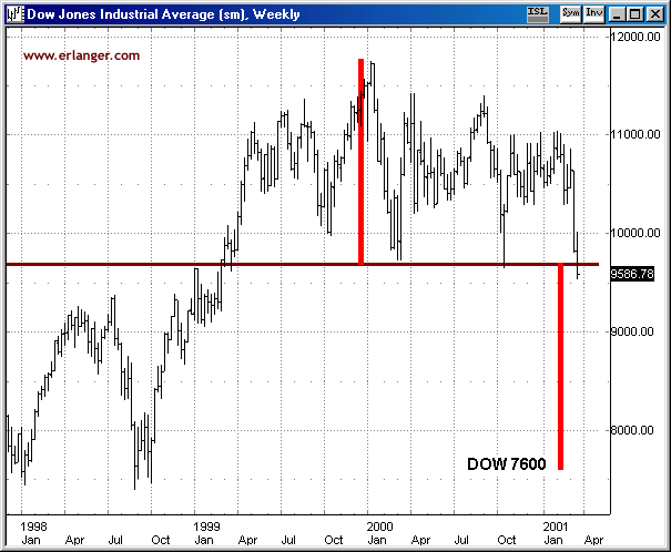
The Dow just traded intraday below the 9600 level that we have
discussed recently. 9600 represents the lower end of the two year
pattern of the Dow Industrials. If the Dow closes below 9600 and
continues to head south over the next few days, this pattern becomes
a rather nasty looking top with resistance at 9600 and a minimum
count down to the 7600 level. We have recently voiced concerns about
Dow stocks, given their tendency to be the last to fall in a bear
market.
Charts of the Week (submitted
03/12/01):
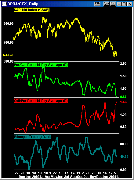
Sentiment remains poor as call buyers (red line) dominate over
Put buyers (green line). Until the sentiment picture changes, the
"long squeezing" will continue.
Charts of the Week (submitted
03/02/01):
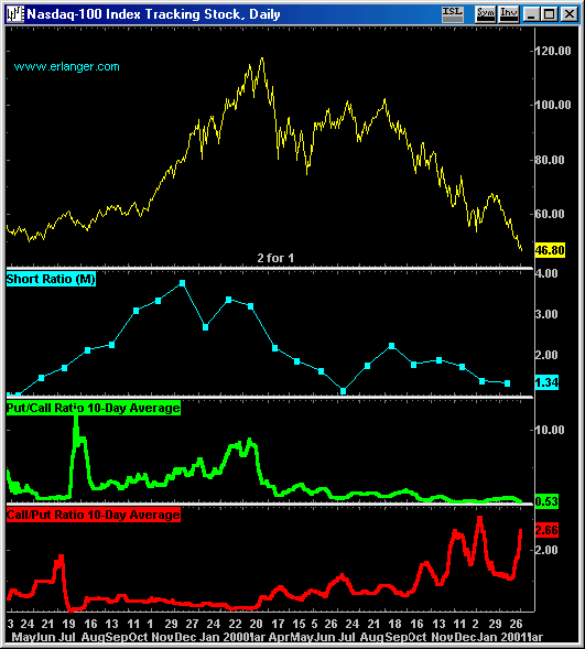
TOO MUCH CALL BUYING!!!!
Charts of the Week (submitted
02/26/01):
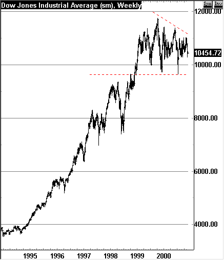
Many moons ago, before the Dow first surpassed the 10,000 milestone,
we contemplated 12,000 as a long-term objective. 12,000 seemed a
level high enough to make 10,000 "appear" as support. The Dow indeed
did hit 11,750.28 on 1/14/00 - close enough. Since then the path
of the Dow has etched out 2 hard tests of the 10,000 level, with
a descending level of peaks (see dashed lines on chart, above).
To technicians, this is a potential descending triangle - a bearish
pattern. The level to watch for the Dow is 9600 - if that level
fails, the descending triangle pattern will be complete, leaving
lots more downside potential. The Dow must break above the dashed
trendline above its declining peaks to improve the pattern. Overshadowing
this pattern are two major negatives - poor sentiment and poor seasonality.
Sentiment remains poor as short selling is light and market opinions
remain overly optimistic - we need more fear. Seasonality is poor
for the next 12 months as depicted in our 20-year
cycle.
Charts of the Week (submitted
02/20/01):
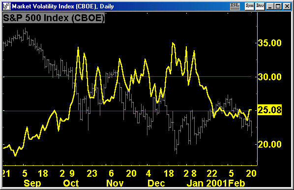
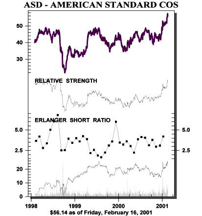
Last week's action was all about toilets. Both electronic and
health technology issues were summarily flushed down the toilet,
while investors blew the lid off toilet maker stock prices (see
chart of American Standard, below). While the bifurcated market
continues, we must point out that sentiment remains awful. Too many
have been focused on technology issues while real moves are underway
in the seemingly more mundane worlds of drillers, medical distributors,
autos, drug stores and toilet makers. Moreover, the CBOE VIX (plotted
in yellow, above) remains at poor levels (25 and below) . Until
the VIX can get back to the 35 area (we still would love to see
40), overall market indices aren't likely to go anywhere.
Charts of the Week (submitted
02/07/01):
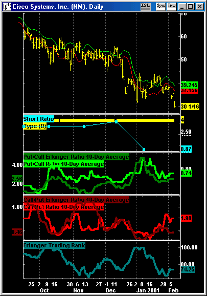
Thought you might like to see our Erlanger 2000 chart of Cisco
(CSCO). It is a classic pattern of weakness. The yellow "Type
4" classification marks CSCO as a poor relative strength performer
combined with poor sentiment numbers - a long squeeze! Short selling
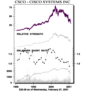
is low at .87 (see chart below), far from those earlier days when
short sellers lacked faith it CSCO's former strength. For example,
on 11/9/99, the short ratio was a heavy 1.74, and price climbed
this wall of worry until its peak in March 2000. Time and again
it seems that prices fall when most are overly optimistic. Our analysis
of options trading, a shorter-term measure of sentiment, shows similarly
optimistic expectations just before the earnings report. Our call/put
ratios(red lines)had climbed to high levels and our Trading Rank
fell back. Until the crowd hates CSCO, price will remain under pressure,
sliding that slippery slope of hope!
Charts of the Week (submitted
01/22/01):
Technology has made a moderate move in our rankings . We are in
the November-to-February positive market season, when one would
expect much out of high beta stocks like technology. The media is
making much out of the "spectacular" percentage gains made in some
technology stocks this month. A little perspective, please. Everyone
who first purchased technology stocks on January 1 please raise
your hands. OK, now everyone who owns technology stocks purchased
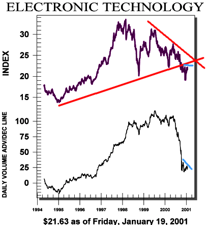
over the prior three years raise your hands. Our chart of electronic
technology (above) depicts the mountainous overhead supply that
exists in technology. On heavy volume, technology has broken down
from a decade long pattern. Until the bulk of technology ownership
turns over so that the cost basis of most shares is lower, the burdensome
overhead supply will persist. Moreover, the daily volume advance/decline
line fails to confirm this month's rally. Bulls should remain very
short-term oriented.
Charts of the Week (submitted
01/15/01):
This past week we observed something rather unusual - a very narrow
dispersion of our sector power (and technical) rankings. 11 out
of the 18 sectors we follow have a neutral power ranking within
a very narrow 3.70 point range. Consumer non-durables is ranked
4th at a 56.75% Power Rank while non-energy minerals is ranked 14th
with a Power Rank of 52.96%. The difference between these 2 Power
Ranks is statistically insignificant, which is to
say, for the moment, that a Power Rank of 4 is basically equivalent
to 14 - a very rare occurrence. To us, this is an indication that
the market has gone limp (that's a technical term). We wish we could
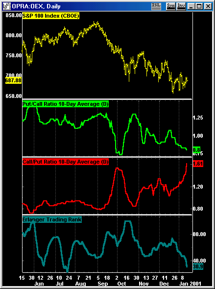
say the same for sentiment. Our OEX chart (above) shows a new high
in the OEX Call/Put Ratio, and our overall Trading Index is approaching
the dangerous "0" level. Sure, the market can rally a bit, but overhead
supply is vast, and any rallies from here will most likely worsen
the sentiment picture.
Charts of the Week (submitted
01/02/01):
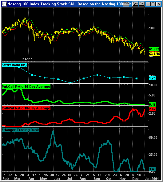
Over the course of 2000, we have favored health services, finance,
and energy sectors, along with other defensive groups like tobacco
and pharmaceuticals. We have eschewed technology. Looking forward,
we recognize the temptation to bottom fish the weaker issues, but
we would rather see some clear relative strength emerge first. Moreover,
the sentiment picture is all wrong for technology - the call buying
in QQQs (above) remains excessive relative to put buying, and the
short interest of the Nasdaq 100 issues (click on "Current
Index Short Ratios" - right) remains extremely light.
Charts of the Week (submitted
12/18/00):
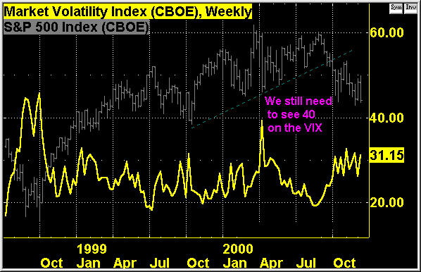
Perhaps the VIX (above) is a clue to why the market has left rally
expectations unfulfilled. Since September when the S&P 500 broke
its uptrend (see dashed trendline), the VIX has stayed in the 30
area. The 30 level often precedes a rally - but what does it mean
when a rally fails to materialize, even after 3 months of the VIX
at the 30 level? We believe this failure is a definition of a weak
market. Before we get a meaningful rally, we will need to see at
least 40 on the VIX, and a change
in sentiment from one of hope to one of worry. It looks like two
Grinches will be big stars this year - the Grinch movie and the
Grinch market!
Charts of the Week (submitted
12/11/00):
It was the best of times, it was the worst of times - depending
on what sector you've been invested in lately. By now all creatures
stirring are aware of how technology stocks have had the "Dickens"
beaten out of them. However, it has been a virtual bull market for
health services, finance, consumer non-durables and utilities -
areas we have favored for the last few months. We continue to hold
great expectations for these while the last of a minor positive
seasonality plays itself out. This seasonal period will last no
further than the 2nd Quarter of 2001. The lack of participation
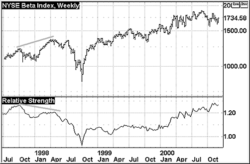
of the high beta technology issues is especially damning considering
the better relative performance of the NYSE High Beta Index (above).
The uptrend of this measure's relative strength will be a significant
key to the market's future. Should the NHB's relative strength line
fail to confirm future rallies (see chart in early 1998), all high
beta issues will be in peril. For now the bifurcated market continues.
Charts of the Week (submitted
12/01/00):
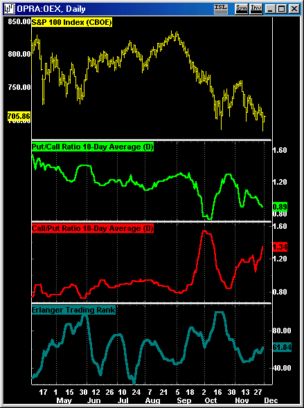
Not what we wanted to see. Despite the lower lows, call volume
actually increased over put volume. The QQQs show a similar pattern.
Too many are looking to buy here. Rallies should help to define
resistance... once again.
Charts of the Week (submitted
11/15/00):
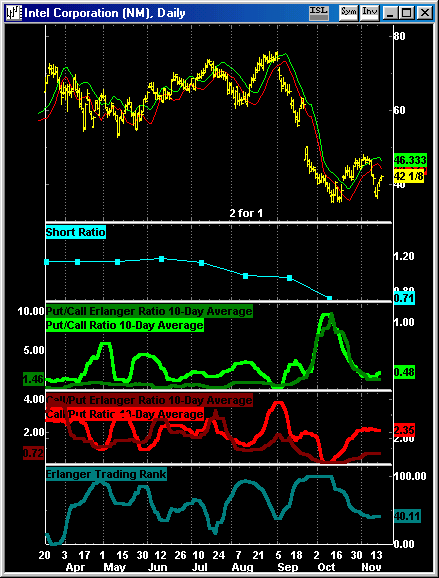
This chart of Intel is a good example of the trading pickle that
currently exists. The trading rally that began in mid October ended
when price sank back below the DMA (displace moving averages) six
trading days ago. Now price is rallying back up to the DMA channel.
For the technical condition to improve, price must rise above the
channel. This will be more difficult than usual because the Erlanger
Trading Rank (blue line) is on the low side - this means too many
are buying calls versus puts. If price weakens after a resistance
test of the DMA lines, this would be a signal to short. A lot is
riding on price near-term behavior.
Charts of the Week (submitted
11/06/00):
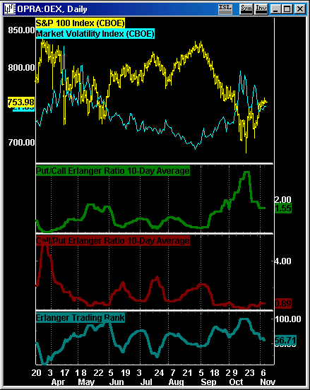
This OEX chart shows the Erlanger Ratios and Trading Rank. Late
October saw much put activity in the options activity for OEX options.
Currently some of these "put" excesses have been worked
off, but we have yet to see excesses in "call" activity
that would signal the end of the current advance phase. Stay tuned!
Charts of the Week (submitted
10/30/00):
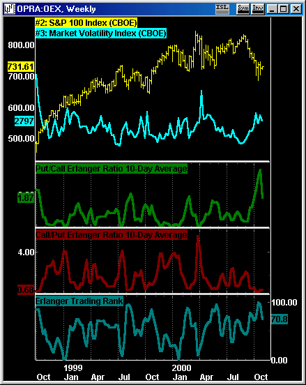
This weekly chart of the OEX shows some of our options indicators.
They are signaling a substantial degree of negative sentiment on
a short to intermediate term basis. The VIX, the Erlanger put/call
premium ratio, and the Erlanger Trading Rank all suggest an advance
phase is due.
Charts of the Week (submitted
10/23/00):
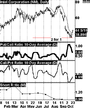
We were impressed by the action in one stock - INTC. As can be
seen above, following an extreme of enthusiasm in August (see call/put
ratio), INTC entered a sharp decline phase of its own, which ended
last week after extreme pessimism (see put/call ratio). INTC finally
moved above its DMA (displaced moving average) line , so the recent
lows appear a good stop loss for a long trade. For more on DMAs,
see our White Paper. Moreover...:
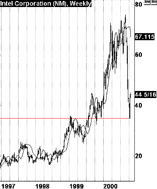
INTC also touched very long-term support (see weekly INTC chart
above).
Charts of the Week (submitted
10/16/00):
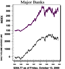 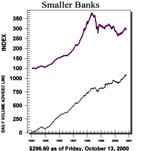
Perhaps due to overall market influences, major banks sank to the
bottom of our finance sector's groups. The charts above show the
volume A/D lines for major banks and smaller banks - major banks
look toppy while smaller banks show stronger accumulation.
Charts of the Week (submitted
10/10/00):
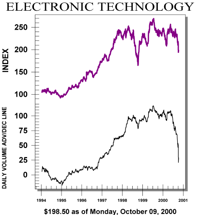
By now it is becoming clear that technology issues are in a bit
of distress. What may not be so clear is the degree of distribution
that is underway in technology. Our longer-term picture of electronic
technology's volume advance / decline line (above) shows the greatest
regurgitation of shares occurring over the last month. One of the
inevitable consequences of such aggressive selling is a lot of overhead
supply - this supply exists in the form of shareholders who wished
they had sold, but didn't. These shareholders will be glad to "get
out" at better prices...unfortunately the market rarely lets such
"weak hands" shareholders out gracefully. Until we see
true capitulation and a reversal of this trend of distribution,
we recommend avoiding the temptation to bottom fish.
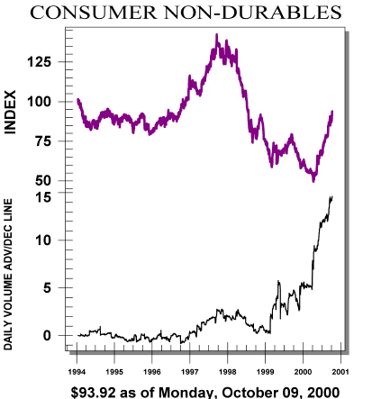
Many of the stronger sectors can be reasonably classified as defensive.
The recent improvement in consumer non-durables (above)is a case
in point. There is a lot of volume accumulation in this sector -
in fact, the volume accumulation has been underway for the past
2 years.
Chart of the Week (submitted
10/02/00):
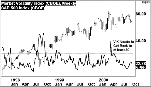
The CBOE Volatility Index (VIX) is a great "barf" indicator - just
look at the 40-plus reading in the 3rd Quarter of 1998! This 40-plus
reading reflected major "barf" sentiment on the part of put options
traders, and coincided with a major low point for the averages.
Despite the beheading of Intel and Apple, the current VIX is barely
above 20. It appears more downside is needed to achieve the desired
"barf" mode.
BONUS Chart of the Week (submitted
09/26/00):
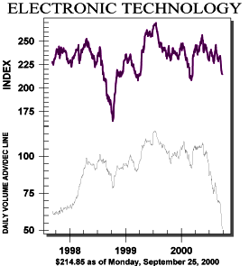
Electronic Technology is experiencing extreme volume distribution!
Chart of the Week (submitted
09/25/00):
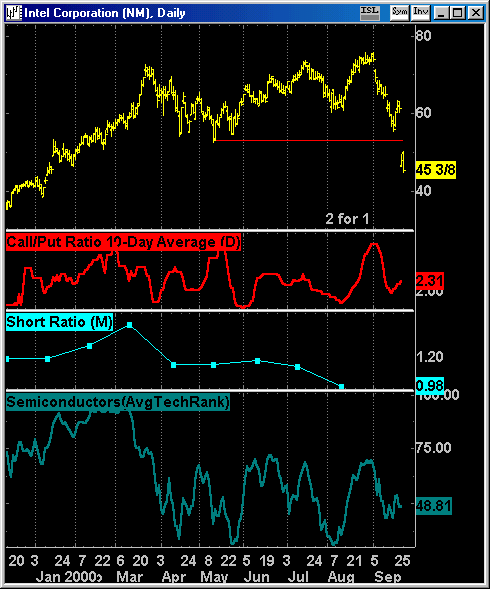
Intel and technology in general had been slipping
in terms of the technicals. Our sector rankings for technology had
been "all over the place", which is to say no positive trends could
be sustained. More importantly, an excess of enthusiasm preceded
Intel's September slide - first the evaporation of short interest
(above), and then an excess of "call" option buying around Labor
Day (above). Moreover, while Intel had scored a new high in late
August, this was not confirmed by the average relative performance
of the semiconductor group which peaked in early March (see Erlanger
Avg. Technical Rank, bottom of chart above). Most disturbing is
the complacency before the end of the day on Friday, when the calls
for a reversal/new advance were legion.
Chart of the Week (submitted
09/18/00):
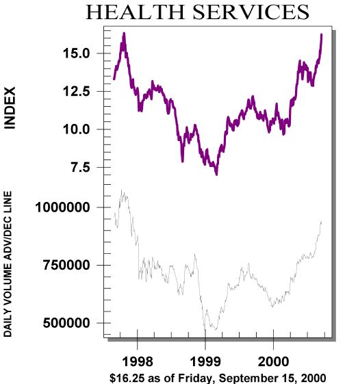
Group and sector analysis can make the process
of selection easier. One sector that has steadily outperformed in
our numbers is Health Services. For the past 18 weeks this sector
has ranked 5 or higher out of 18 sectors. Currently it is ranked
second, but in terms of our Erlanger Technical Rank, it is the strongest
sector with a powerful reading of 72.19. This means that on average,
Health Service issues sport the best relative strength patterns.
More comforting is the chart above, which shows this sector's "daily
volume advance/decline line". Note the positive divergences over
the last 12 months, leading the way at intermediate turning points.
This indicates continuing accumulation underway. Too bad most sectors
fail in comparison!
Chart of the Week (submitted
09/11/00):
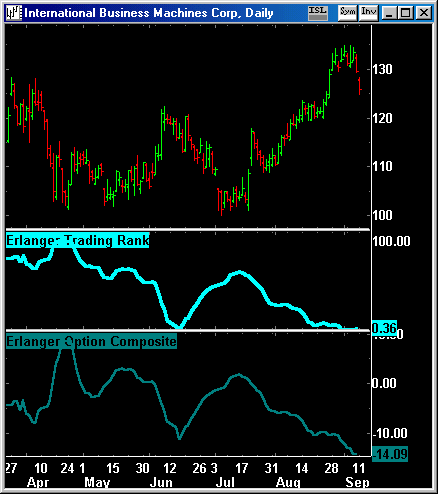
One of the factors that drives stock prices is
sentiment. The more people favor an issue, the more interest there
is in buying. There comes a time, however, when enthusiasm can become
overdone - perhaps all the buying that could happen has happened.
It is at this type of sentiment extreme that a stock is vulnerable
to a trend change. Our Trading Rank is a normalized expression of
our Option Composite. The Option Composite reflects volume, open
interest, premium and money flow analysis on a put/call and call/put
basis. The higher the measure, the greater the put activity versus
the calls (reflecting greater negative sentiment). The lower the
measure, the greater the optimism. The current measure for IBM (see
chart above) is very low, somewhat similar to early June, when IBM
sold off sharply. We believe this is a vulnerable time for stocks
like IBM that are coming off recent strong advances.
Chart of the Week (submitted
08/22/00):
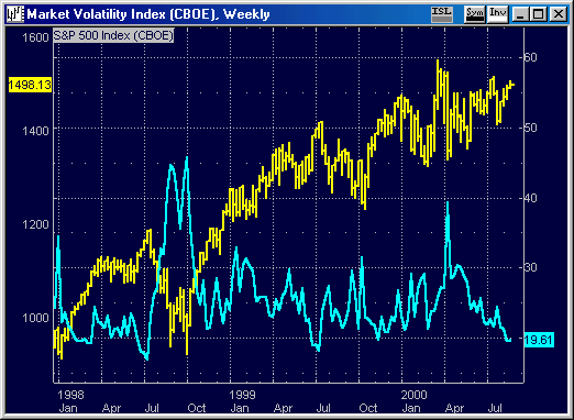
One of our favorite measures is the CBOE Volatility
Index (VIX). It measures the willingness of options traders to overpay
for put options. Levels of 30 and higher have represented times
when expectations were negative in the extreme - often associated
with intermediate lows for the market. Reading on the VIX of 20
or lower represent times when options traders are less willing to
pay for puts because their expectations are extremely positive.
These are often intermediate market tops. The current reading of
19.42 brings us into a danger zone from a sentiment point of view.
We view this as particularly precipitous because the averages have
not gone to new highs for the year...yet the VIX is at its most
enthusiastic reading since July of 1999. The market is doing a lot
less to create greater enthusiasm - use any advances from here to
raise cash!
Chart of the Week (submitted
08/14/00):
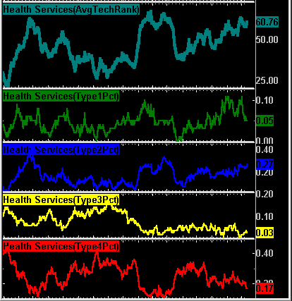
The Health Services sector again rose to our number
1 sector ranking. This graphic shows a variety of our measures,
and deserves a bit of explanation and interpretation. The top line
is the average Erlanger Technical Rank for the sector. It reflects
the relative strength of the constituent Health Service issues.
The higher the number, the greater the percentage of outperforming
Health Service issues. Currently it is at historic highs, and trending
nicely. The rest of this graphic shows the Erlanger Type classifications
as a percentage of the entire Health Services sector. For example,
on average Type 1 short squeezes are dwindling...but so are Type
4 long squeezes. Type 3s are at low levels, which means no one is
successfully short these issues. The key is the Type 2 measure (blue
line)- it reflects issues whose strength are widely recognized.
Type 2s have strong relative strength but few short sellers. So
the conclusion to all of this is that the Health Services sector
is broadly strong, and more and more investors are recognizing their
value. They are therefore in transition from "buys" to "holds".
The fact that our number 1 sector is a hold says much about this
market, n'est pas?
|


